Toast -
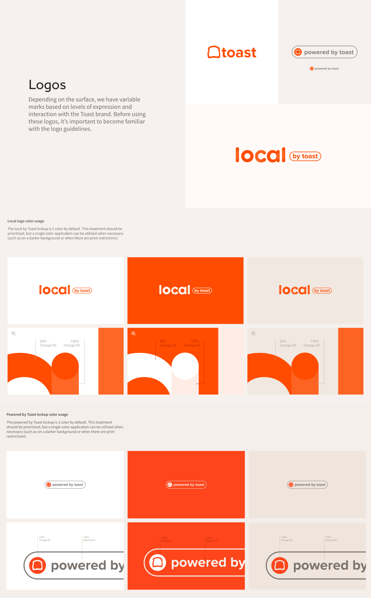
Consumer Brand Style Guide
& Takeout App (Design System)

A seamless consumer experience that reflects the warmth and authenticity of their local restaurant community, enhancing and enabling future interactions with their favorite dining establishments to inspire loyalty and help Toast customers thrive.

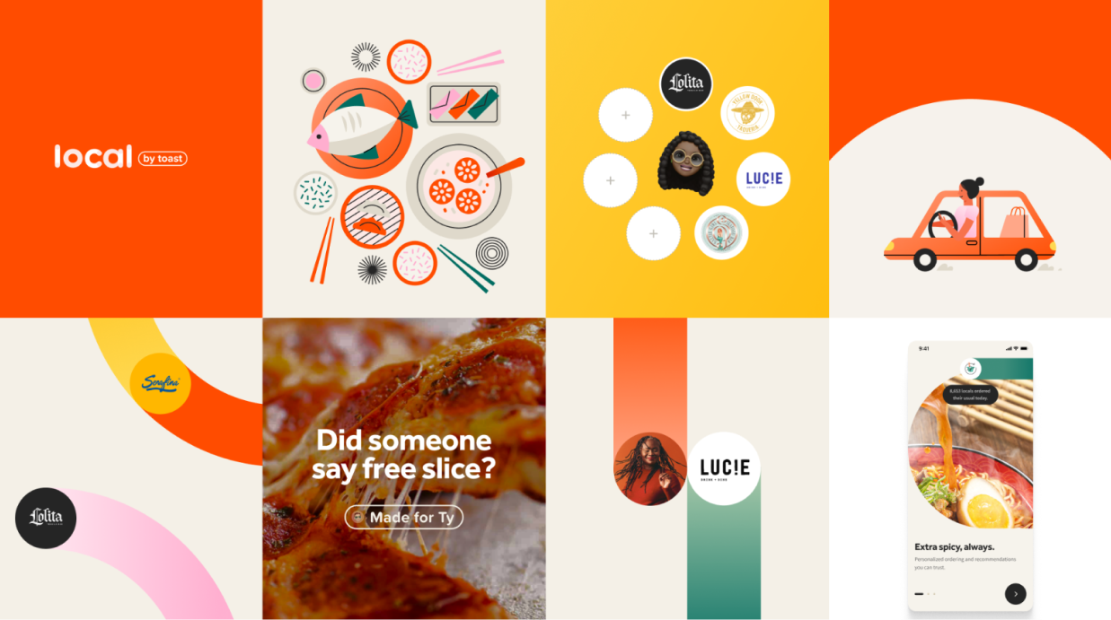
Line 1173
2024
Product Design
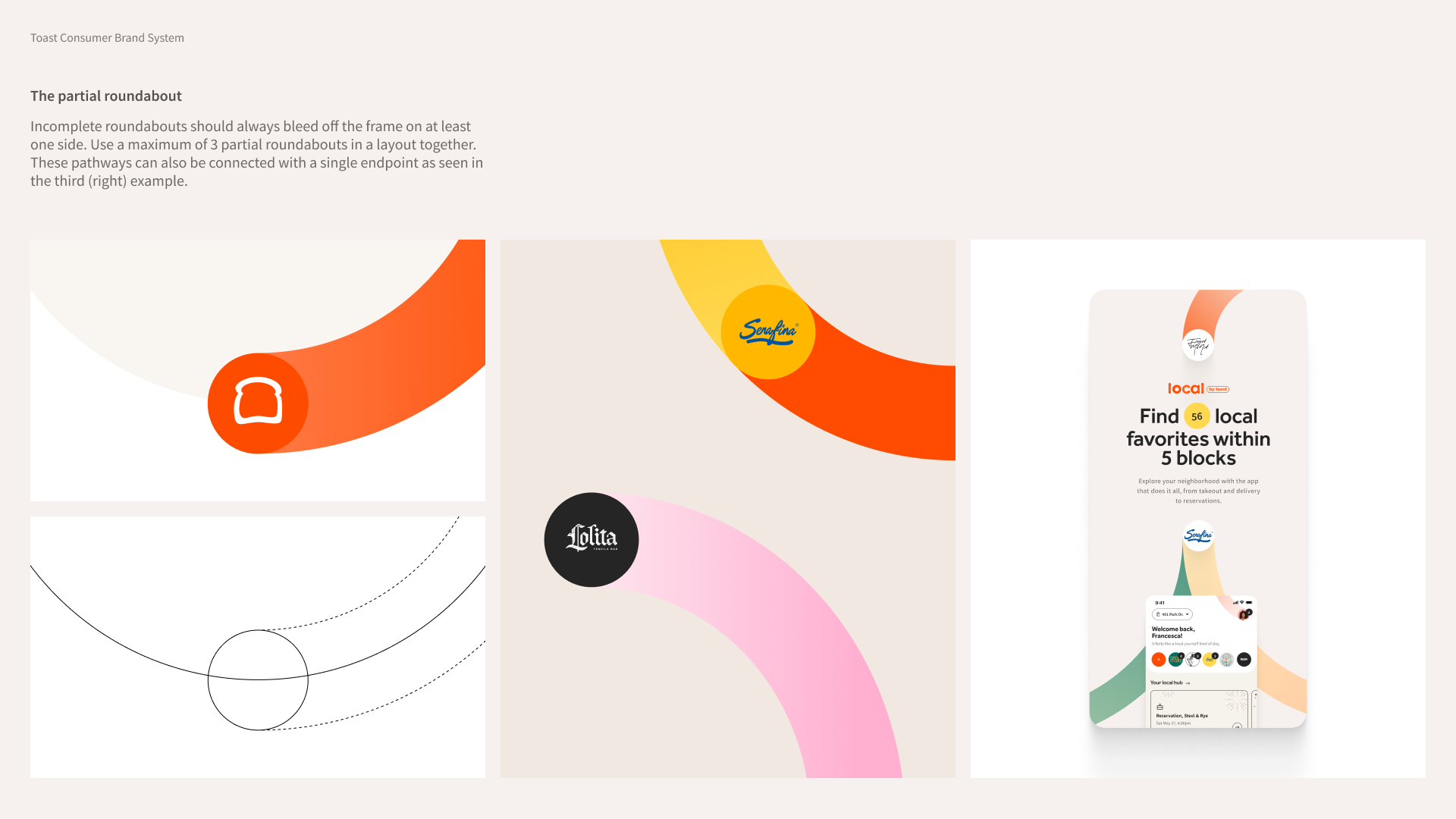
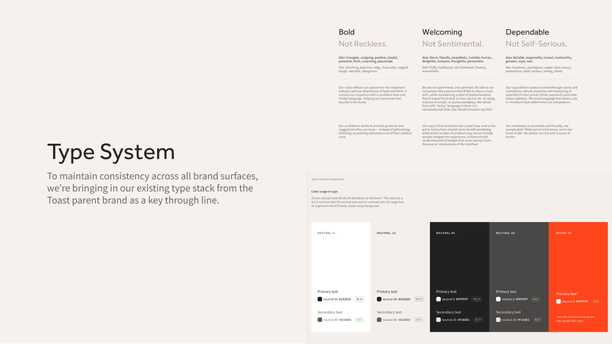
Consumer Brand Style Guide 1
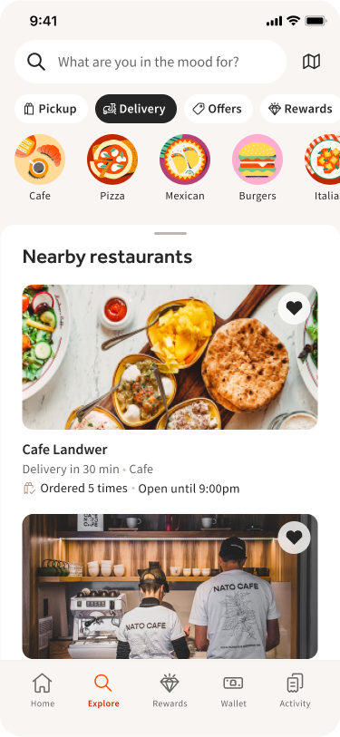
Screen Shot 2024-03-04 at 9.47 1 Explore_ Delivery
AT A GLANCE
As a restaurant operating system powering end-to-end dining experiences, Toast is uniquely positioned to build a differentiated product for consumers, delivering a new level of value and convenience. While we developed our digital ordering product (Takeout App) primarily as tool  to help restaurants serve their guests, we’ve identified an opportunity to go beyond this!
Building off the strong B2B foundation, this product can create magical, consumer-first interactions that connect them more authentically to their local restaurants, fostering a massive network of devoted fans who actively seek out Toast establishments.
ROLE
& CONTRIBUTION
Lead Product Design
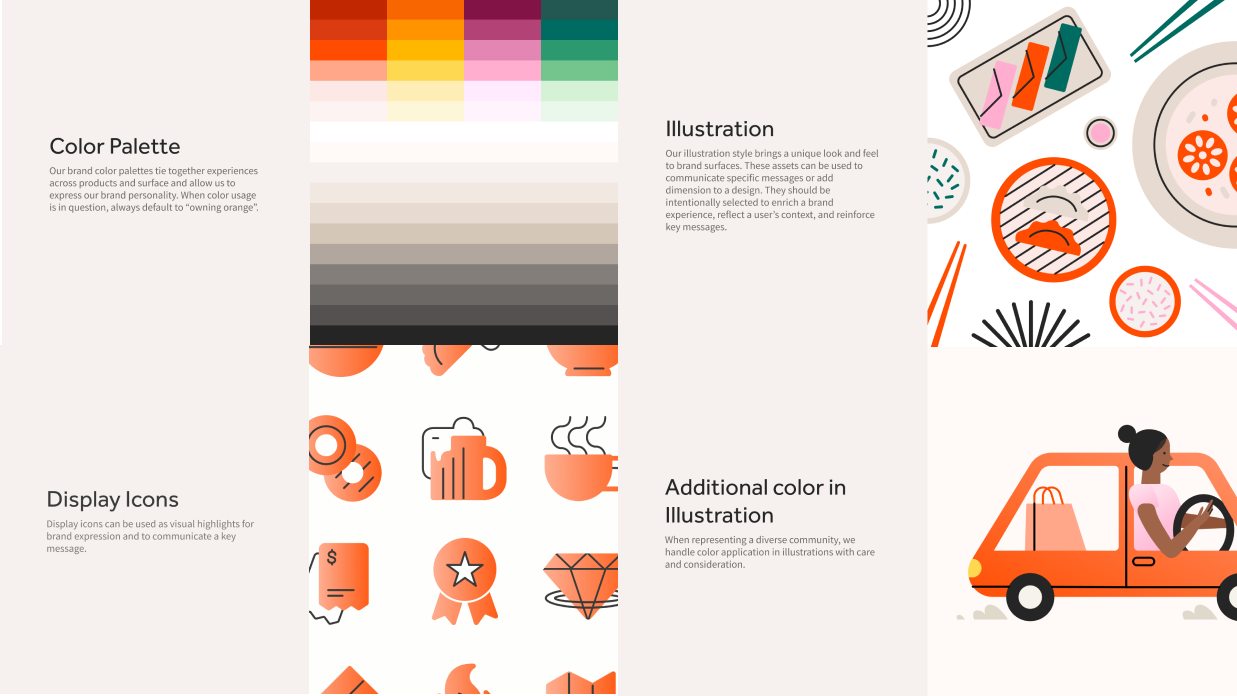
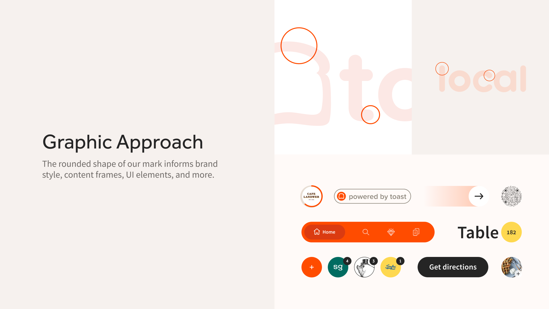
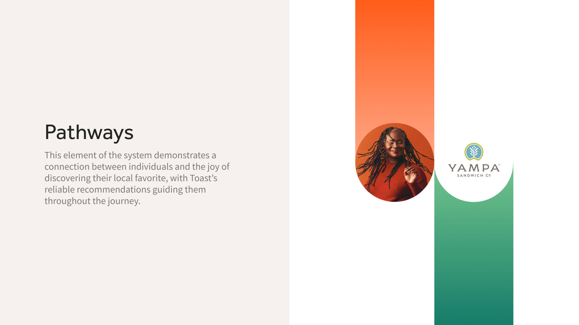
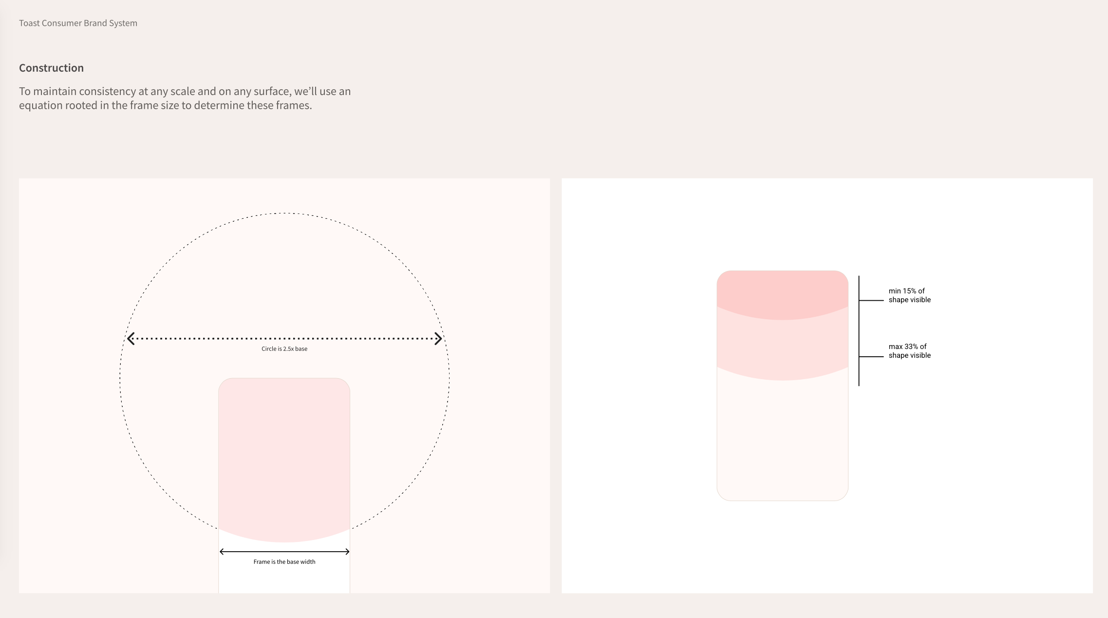
- Define the Toast consumer brand positioning and codify all brand elements, including the unique visual system that makes the expression ownable, consistent, and memorable.
- Create a scalable system for efficiency and velocity.
- Create robust tactical guidelines to empower self-service and enable strategic design and execution decisions.
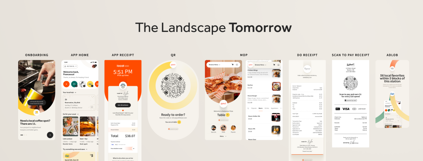
- Ensure cohesive and consistent interaction across all surfaces for an experience that reflects the seamless capabilities.
- Establish clear parameters for use.
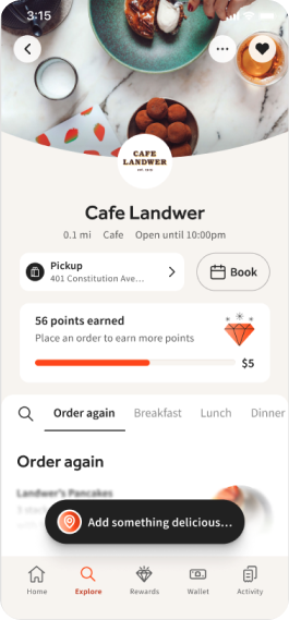
- Takeout App redesign (WIP).
IMPACT

People have begun to embrace the brand and are mastering interaction with its consistent visual language.

The team of engineers experienced a noticeable decrease in workload, attributed to their ability to reuse existing UI components. This efficiency was further facilitated by the designers' provision of more consistent mockups adhering to a set of predefined patterns.

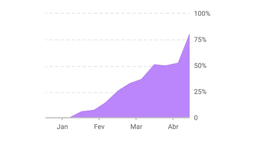
Business Metrics - Adoption Rate

Internal Metrics - Design to Development Handoff
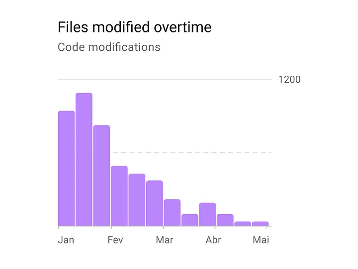
image 84 image 85

In less than half a year, the component library experienced substantial growth, with coverage expanding from 9% to an impressive 89%.

Maximizing the reuse of components is the primary objective in advancing the design system. Currently, default component usage stands at 36.4%, while adjusted component usage has increased to 45.5%. However, there remains a portion of 18.2% of component usage categorized as detachments, indicating areas for improvement.

Quantitative Metrics - Components Coverage

Quantitative Metrics - Components Usage
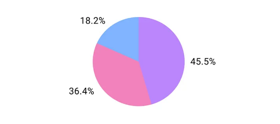
image 87
Screen Shot 2024-03-03 at 2.22 1
Default Components Used
Adjusted Components Used
Secondary Components Coverage
Main Components Coverage
Component Detachments (Figma)
Line 1179
Group 427321947
Consumer Brand Style Guide
Group 427321944
701 705 1
Screen Shot 2024-02-19 at 7.21 1  Group 427321946 Line 1185

Takeout App Design System
& Component Build Process

STEP 1: Design Audit

Where the components show up across products,
decide how many of those versions are actually needed.

STEP 2: Prioritize

Which ones are most core? Let’s design those first.

STEP 3: Prototype & Pressure Test

Apply the component across applicable surfaces to pressure test the result. Refine.

STEP 4: Test
Accessibility and usability.

STEP 5: Document & Communicate

While this should happen ahead of time with teams, share final result in #design-guest-native (something public)

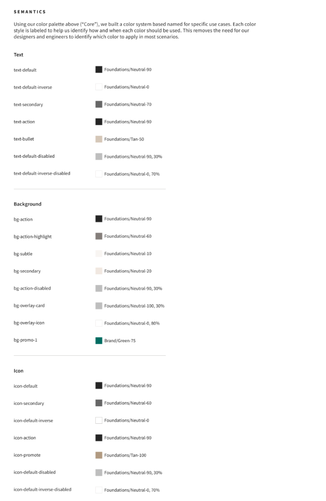
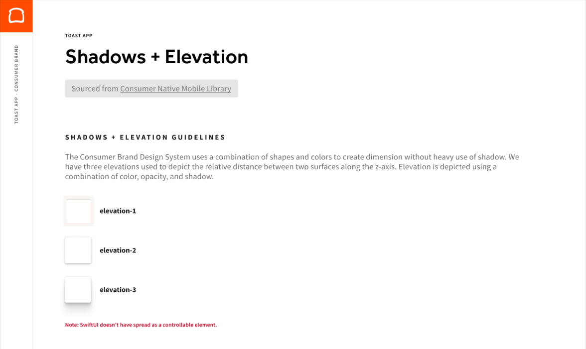
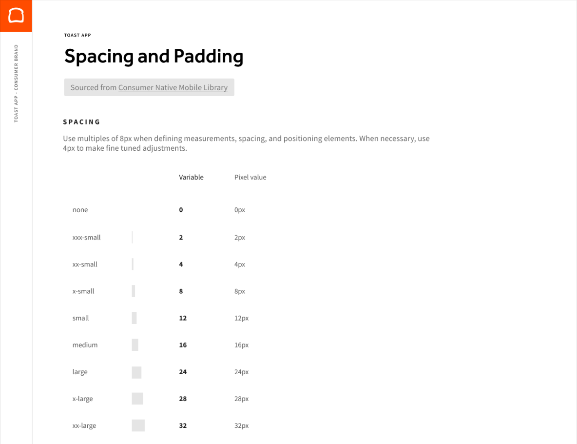
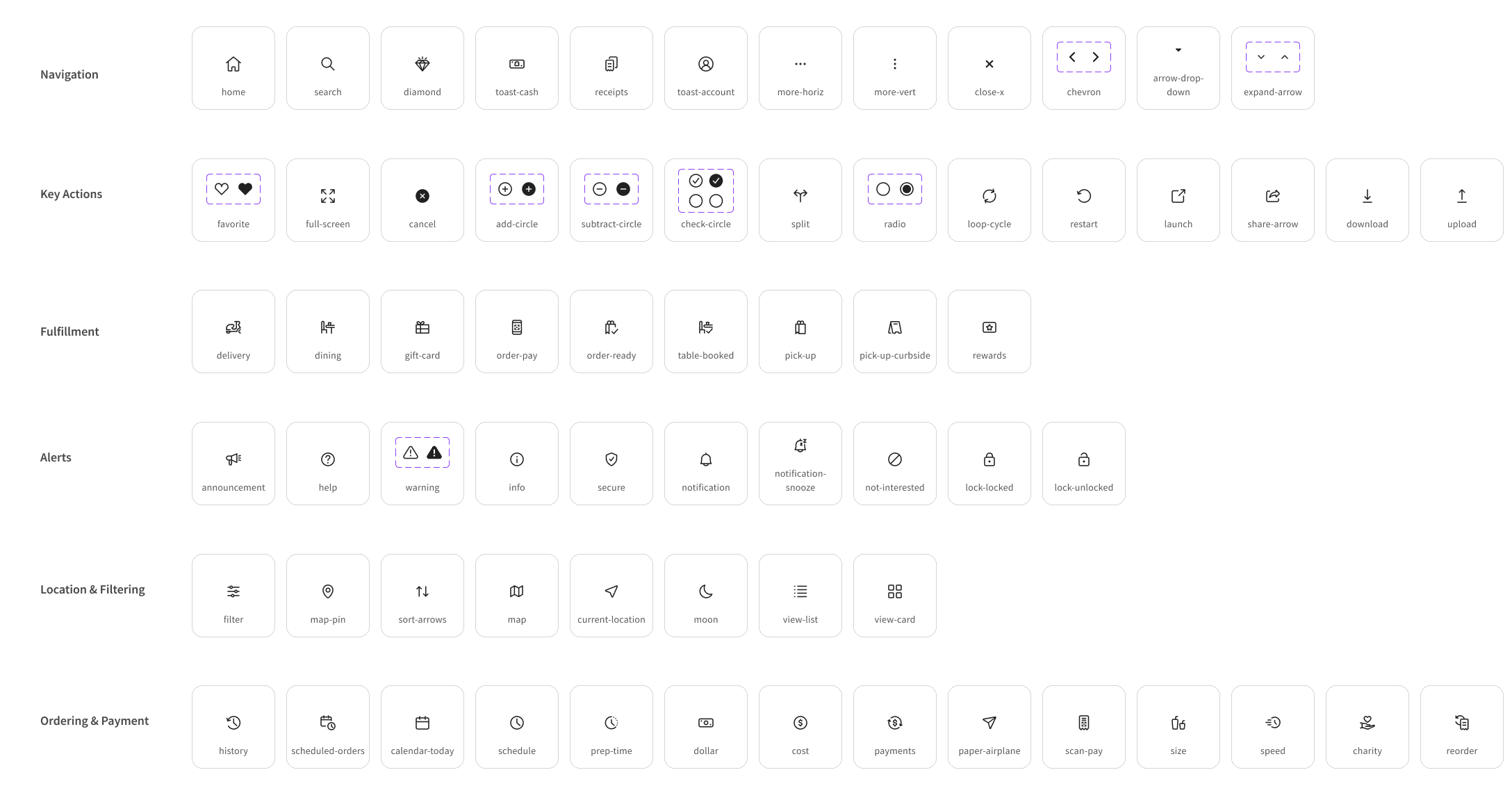
Design System - Foundations
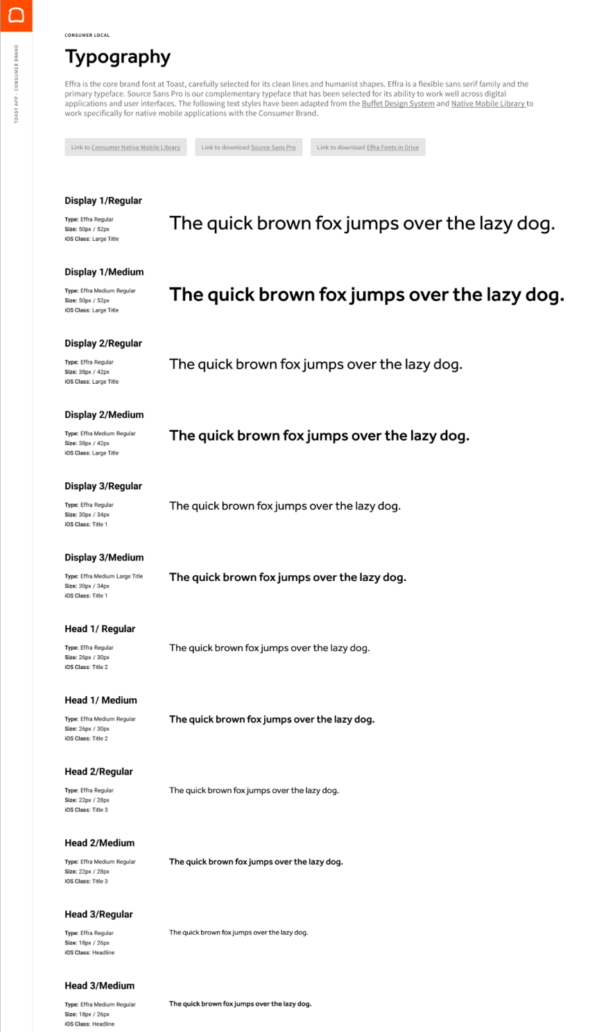
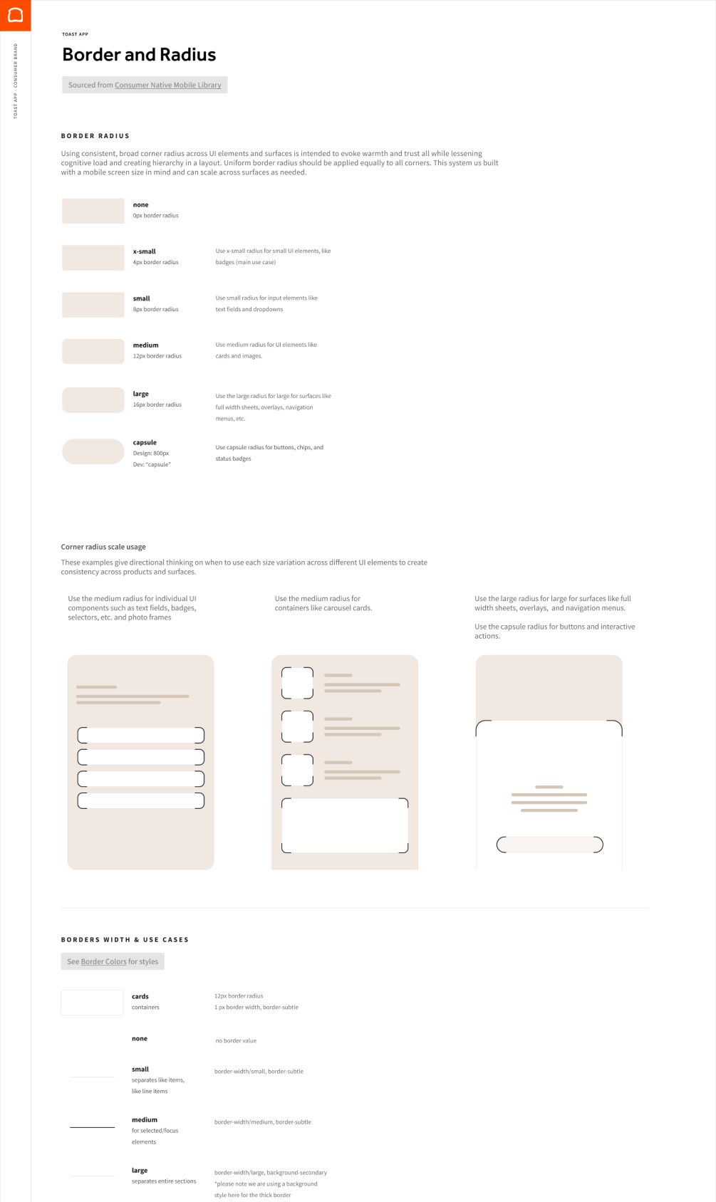
Consumer Native Mobile Library (In Progress) Border Guidelines
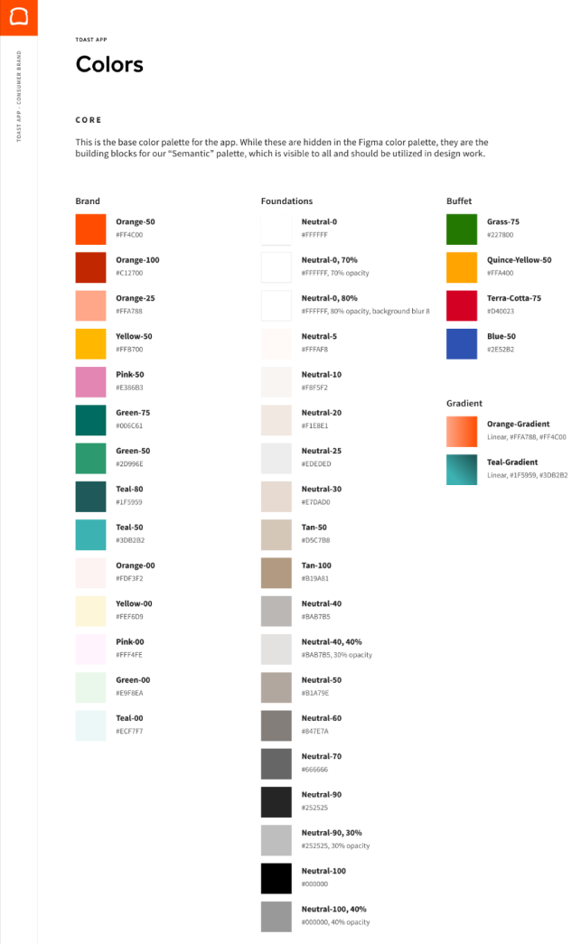
Color Guidelines Color Guidelines
Shadow and Elevation Guidelines Spacing Guidelines
Utility Iconography
Screen Shot 2024-03-04 at 9.27 1

Design System - Components

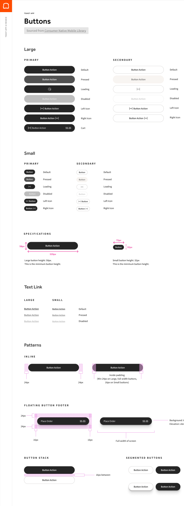
Button Guidelines
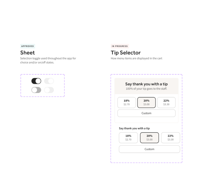
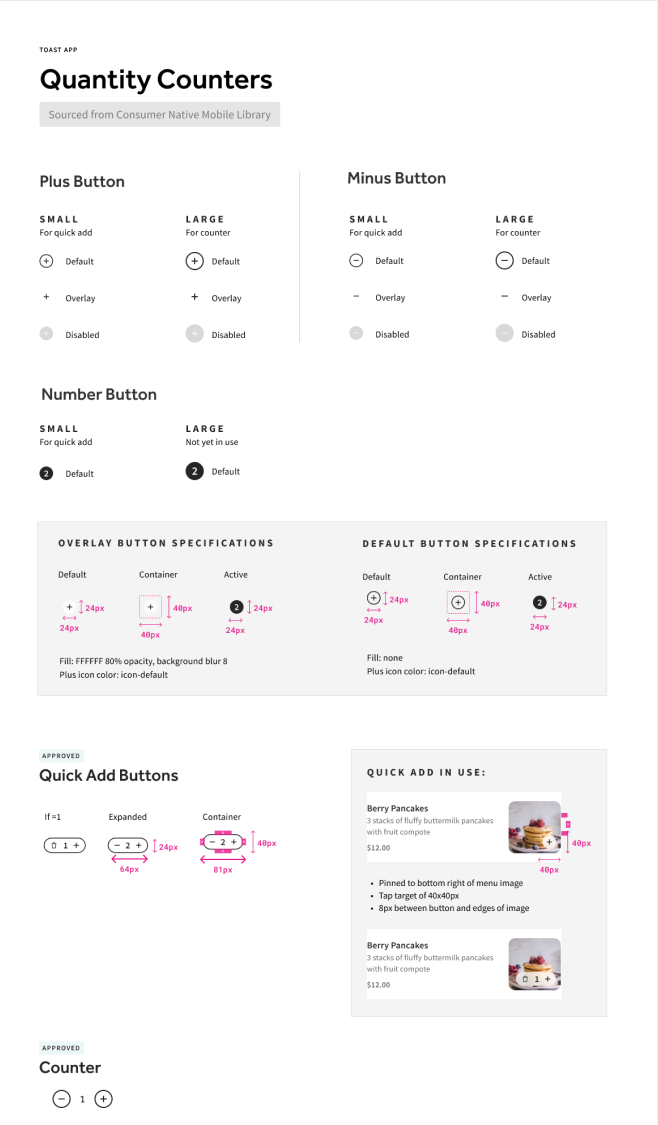
Selectors Quantity Counters
Line 1173
Consumer Brand Style Guide 3
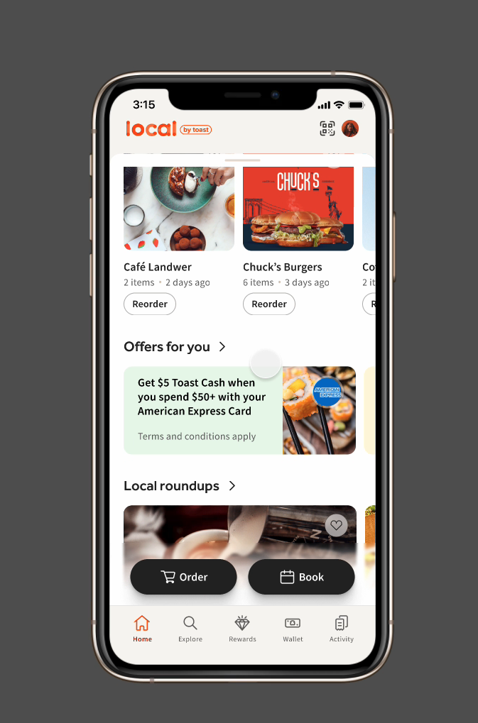
Takeout App Redesign

Takeout App Redesign - Prototyping
Screen Shot 2024-02-20 at 1.37 1
Frame 57112
Thanks for scrolling
Line 1184
AshCui_Black Work_Black About_Black